 |
| This was a year ago or so when I made this. It is the only project I have ever made out of coils. It is a variation of Horton hears a who. This is also a different clay body then I had ever worked with. it is fifty percent stone were and fifty percent porcelain and it was very fun to work with. I tried to get creative with the glazing trying to imitate doctor sues. |

 |
| This was the first piece I have ever made out of food and I think it was a success it is a lemon poppy seed cake with four pillars of sugar with a final ball of spun sugar on top of the four towers. It is one of the funnest things I have made in a while. |
 |
| The inspiration for this piece was to make a functional piece of art on the lath. The candle stick was first functional piece I ever made on the lath. It took me at least 4 or 5 try's to have the candlestick actually come out but it was worth it because it is my favorite piece I have ever made on a lath. |
 |
| This was my first glass blowing expedition ever which turned out better than I expected it was actually supposed to become a spiral in the center of the circle and rippling out but I like to think of it as a happy mistake because I happen to like this piece a lot. |
 |
| This was the second thing I ever made in glass, and it was the first time I actually tried to make a realistic design in the glass. It was supposed to be a flower if you couldn't tell but it was a lot of fun to make. |
 |
| The mushroom was the latest thing I have made in glass this was actually the easiest thing to make in glass because you are just pushing colored glass in the bottom of the egg shaped piece of glass and letting it mushroom it self. I chose that color to make the mushroom kind of psychedelic. |
 |

 |
| These three pieces I made on the lath were a beginning of a chess set the top one was a castile the middle one was a bishop and the last one was the beginings of a qween |

 |
| This pot has been by far may favorite pot I have ever made in clay. The theme around the pot was about water. The bottom carvings are two flying fish circling the bottom of the pot with the top carvings being big water droplets cascading down on top of them. The top is a hollow sphere thrown on the wheel and is glued to the top of the pot with multi colored glass. The glazing was supposed to be very dark blue and a light green but the way it turned out looks even better. |


 |
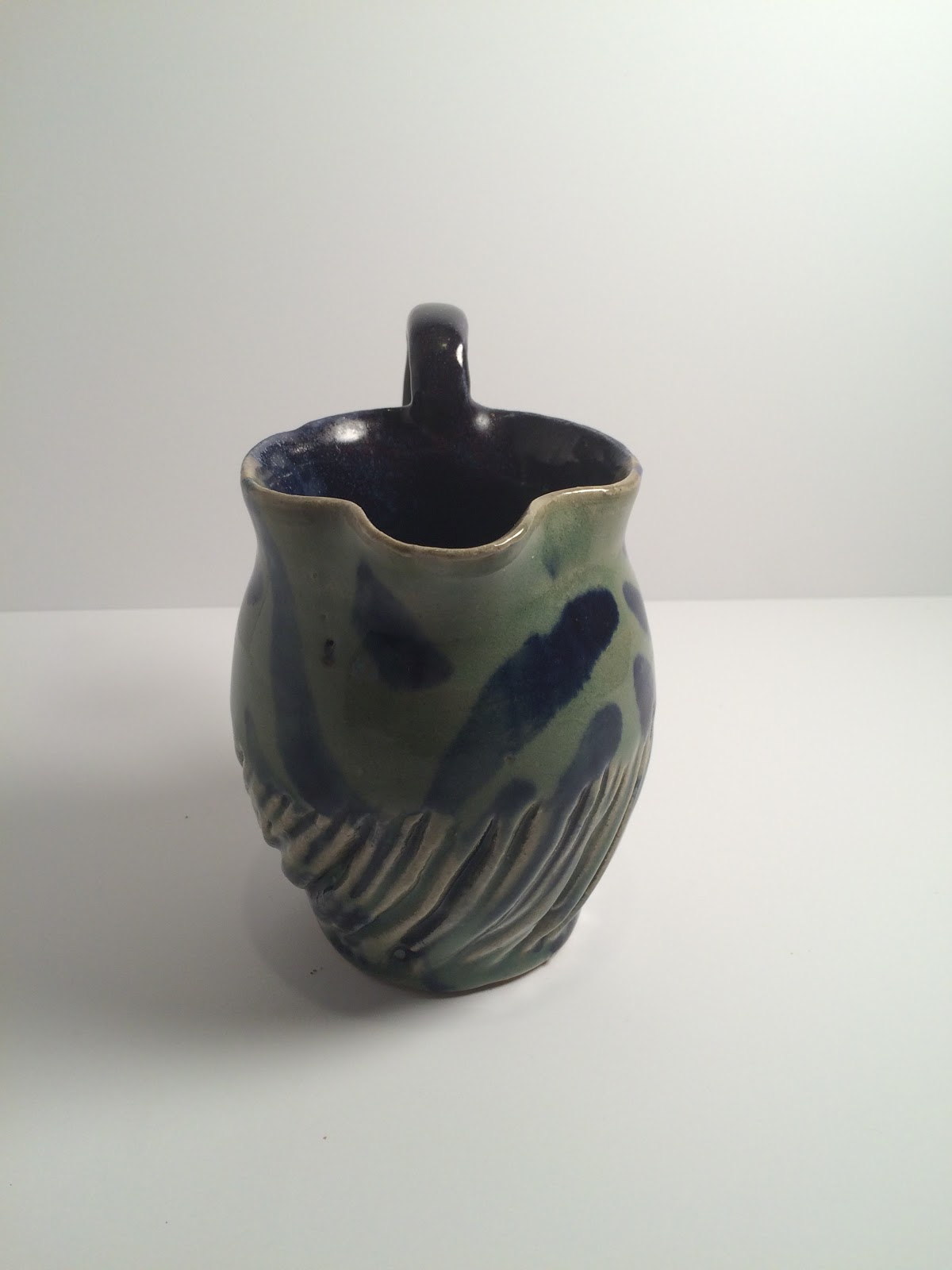
| This pitcher was the first ever attempt at a pitcher and I am very pleased at the way it looks but the only issue is that it doesn't actually pore. The spout is too high and so the water pores out the top but overall I am pleased with the results. The glazing turned out perfect with a thick red coating with dark blue streaks running down the sides. |


 |
| This is my favorite Raku piece in my collection I have only two of them. I had two more but those are currently missing. But even out of the missing ones this is by far my favorite. I used wax to prevent the glaze from touching the elevated parts of the pot and then glazed the whole thing turquoise, I do not know where the red came from but I am very pleased it is there. Then the parts of the pot that were elevated turned black in the firing. This pot was inspired by Kate vorhaus I based it off some of the pots Kate Villarreal brought into the studio. |

 |
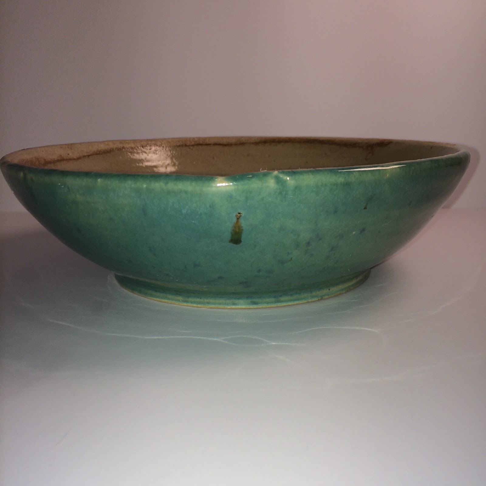
| This pot was made when I was experimenting with throwing as small as I could. I do not know if you can tell from the picture but this pot is actually about the size of your thumb. The glazing was light green with blue cobalt streaks |

 |
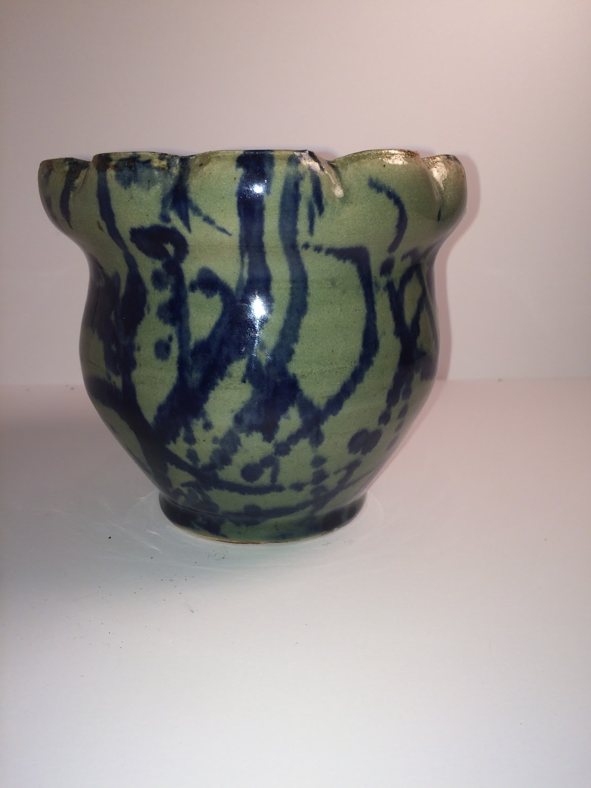
| This vase was made in my earlier years of throwing and it was one of my first ones. I crimped the top to make it look almost flower like. the glazing on the outside is light green with blue streaks on the outside with a dark red glaze on the inside that is also speckled in blue. |

 |
| This is my only Majolica piece I have ever made. My inspiration for the piece was actually a raspberry bush outside Kate Villarreal home and when I was making it I decided to make it a looser image rather than try to make it look real. The inside of the rim is the same design but I flipped the colors and the inside of the pot is yellow for the feeling of sunlight. |

 |
| This was probably one of the first pieces I have ever made. It was when I was just learning to through as a freshmen in high school. the glazing is dark green on one side and dark blue on the other. |
 |
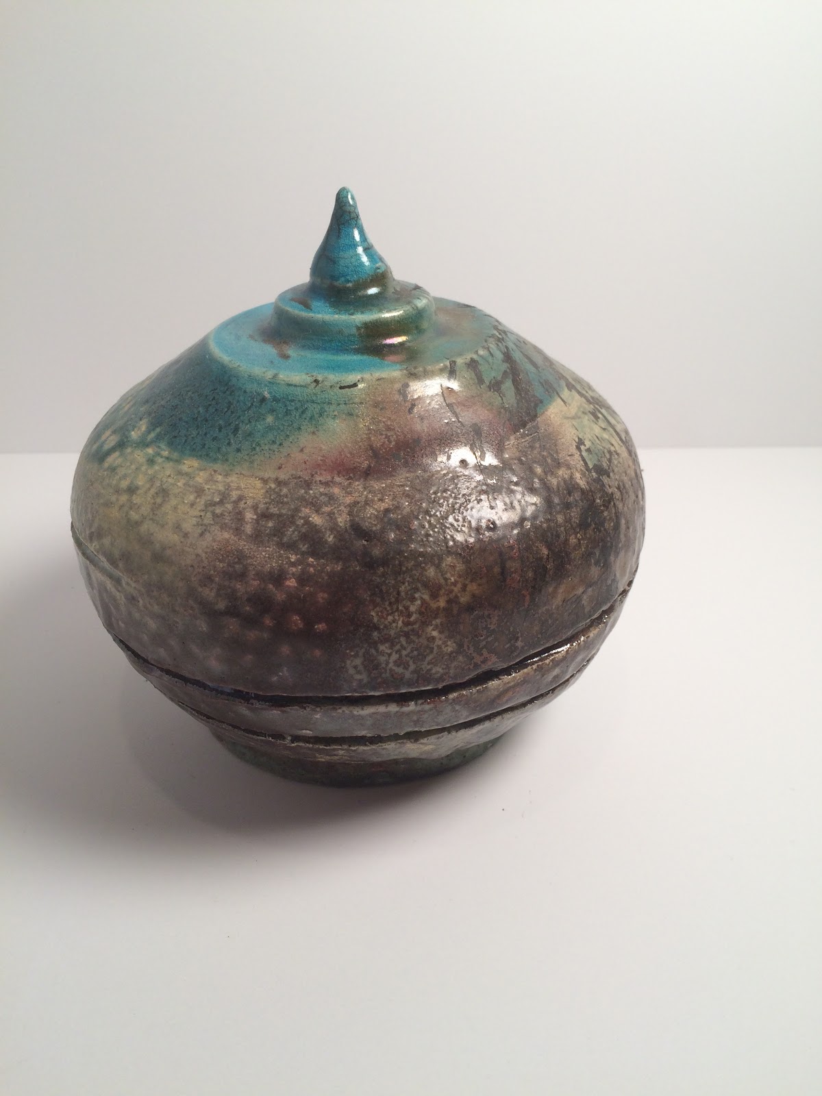
| This is my only other raku Piece in my collection because the two others are missing. This was the forth raku piece I had ever made and the idea was to create a kind of temple at the top of the pot. The glazing was light turquoise on the top with oil luster on the bottom but it turned out the oil luster glaze was to old so it didn't turn out. |

 |
| This is also one of my really early pieces and it was my first attempt at a lidded pot. The glazing was dark purple all around. |

 |
| This was in a series of cups I was making that that were all similar size but they were different shapes. the glazing was dark blue on one side and red on the other but due to oxidation it turned out green and blue in the firing. |

 |
| This was also part of the series of cups. The glazing was red on the outside and blue on the inside. But again due to oxidation the outside turned green. |

 |
| This is one of my very first bowls and it is also one of my favorites. I melted blue and green glass in the bottom which turned into crystal's in the firing. The outside is red with blue streaks and the inside is a light green. |

 |
| This project was also a very early bowl from when I started throwing, the glazing is meg white with blue cobalt pattern. the inspiration for this was actually a pot I saw in my history class the middle is supposed to be an eye with an ouside pattern surrounding it. |

 |
| This bowl was part of a series of crimped bowls I was creating each with a slightly different pattern around the rim. the glazing was red on the outside that turned green in the firing and a blue swirl on the inside covered in clear glass. The next two pots are also part of the series. |

 |
| This is number two of the series the top is crimped more but all the crimps are the same. the glazing is light green with blue drops around the inside and outside. with drops of dark green running down the sides. The dark green is actually red that was turned green in the firing. |

 |
| This is the last part of the series of crimped bowls. for this bowl I crimped edges the corner of a piece of wood to create the sharped edge. the glazing is a thick light green with blue spots. There is also thick streak of red going down the side. the reason for the thick streaks of red down the side of some of the pots is to get this color you get in the middle of this pot. If the red is thick enough the glob will turn this beautiful red with green dots in the middle because the green dots get more oxygen then the rest of the red which turns it green. |

 |
| This could be my favorite piece but it is to close to call. this is actually also part of the series but I really wanted to do something special for this bowl because I loved the shape so much. I used a stencil to make dots around the edge to create a rose in the middle. Then I carved around the edges of the stencil to make the rose really pop. I colored the rose blue because it is the only color that goes under the light green that clearly. the inside glazing is light green that turned yellow in the firing, and the outside is heavy red that turned green in the firing due to oxidation. |

 |
| This is one of my favorite basic bowls. it is just a nice shape and my favorite cereal bowl. I created it just for that I wanted to make a bowl that I really liked to eat out of and this was it. The glazing was red on the outside with blue on the inside, but due to oxidation the outside turned red but I couldn't be happier with the glazing. |


 |
| This is the second pitcher I have made it is much smaller then the first but it is much more functional. I made the pattern at the bottom by cutting out pieces of clay to make lines then glazing them differently. The glazing is light green on the outside with dark blue lines. Then on the inside is just dark blue glaze. |

 |
| This is a early cup that I made when I was first starting, instead of crimping the edge around the lip because it would make it hard to drink out of, I made dents in the side of the cup as a design. |

 |
| This is one of my favorite lidded pots, even though that nether my teacher or my parents liked this one mostly because of the glazing. But I really enjoy the way this one turned out it is more out there then some of my other pieces. Instead of a boring old solid color it is more exiting and interesting. It didn't come out the way it was supposed to but I like that. |

 |
| This is actually the first thing I ever made in clay, and an interesting thing about this one is that it is my moms favorite piece of any of mine and since she is a professional artist that stuck with me. I do not necessarily agree with her but is is interesting to think why she would say that. The glazing is a vibrant orange on the orange with green on the top and a mix of red orange and yellow on the apple with brown for the stem. the plates under the fruit is a dark green. |


 |
| For this project I decided to focus on the theme of obesity. Obesity has been a massive problem in this country and around the world and the sad part is how fast it is progressing. 50 years ago obesity wasn't even a thing and now it is one of the biggest problems facing the world today. Everything in this project is made of sugar, The stain glass, Obesity sign and the spun sugar on top are made of jolly ranchers. The actual structure and the people are made of gingerbread, the words are made of icing and the glue is made of mostly powdered sugar. The flags represent the top ten obese countries around the world. I feel very impacted by this subject and I am planning on basing my career on it being a personal trainer. We need to fix this problem and the only way to start this daunting task is by awareness I hope my project inspires you to do something. Whether your contribution is big or small it is important in the fight against obesity. |
 |
This project is my first relief sculpture that I have ever done the theme has to do with what humans are doing to animals in the ocean. Animals like the dolphin and the sea turtle are both being effected by over fishing, both animals are being caught by accidents in nets used for catching large amounts of fish. The whales are being effected by Japanese whaling ships, being killed for oils. And lastly things like octopi are being kept in captivity where many of them are very depressed and unhealthy because of there living conditions. Lastly they all represent the things we have done to destroy our oceans, like the floating mound of garbage that is now as big as the continental united states. Also things like global warming have been effecting the temperature of the entire ocean. These can be prevented if we are all working together but the problem is that we may never all work together.  |